{"value":"[Amazon SageMaker Data](https://aws.amazon.com/sagemaker/data-wrangler/) Wrangler is a purpose-built data aggregation and preparation tool for machine learning (ML). It allows you to use a visual interface to access data and perform exploratory data analysis (EDA) and feature engineering. The EDA feature comes with built-in data analysis capabilities for charts (such as scatter plot or histogram) and time-saving model analysis capabilities such as feature importance, target leakage, and model explainability. The feature engineering capability has over 300 built-in transforms and can perform custom transformations using either Python, PySpark, or Spark SQL runtime.\n\nFor custom visualizations and transforms, Data Wrangler now provides example code snippets for common types of visualizations and transforms. In this post, we demonstrate how to use these code snippets to quickstart your EDA in Data Wrangler.\n\n#### **Solution overview**\n\nAt the time of this writing, you can import datasets into Data Wrangler from [Amazon Simple Storage Service](http://aws.amazon.com/s3) (Amazon S3), [Amazon Athena](http://aws.amazon.com/athena), [Amazon Redshift](http://aws.amazon.com/redshift), Databricks, and Snowflake. For this post, we use Amazon S3 to store the 2014 Amazon [reviews dataset](https://jmcauley.ucsd.edu/data/amazon/links.html). The following is a sample of the dataset:\n\n```\n{ \"reviewerID\": \"A2SUAM1J3GNN3B\", \"asin\": \"0000013714\", \"reviewerName\": \"J. McDonald\", \"helpful\": [2, 3], \"reviewText\": \"I bought this for my husband who plays the piano. He is having a wonderful time playing these old hymns. The music is sometimes hard to read because we think the book was published for singing from more than playing from. Great purchase though!\", \"overall\": 5.0, \"summary\": \"Heavenly Highway Hymns\", \"unixReviewTime\": 1252800000, \"reviewTime\": \"09 13, 2009\" } \n```\nIn this post, we perform EDA using three columns—```asin```, ```reviewTime```, and ```overall```—which map to the product ID, review time date, and the overall review score, respectively. We use this data to visualize dynamics for the number of reviews across months and years.\n\n#### **Using example Code Snippet for EDA in Data Wrangler**\n\n1. Download the [Digital Music reviews dataset](http://snap.stanford.edu/data/amazon/productGraph/categoryFiles/reviews_Digital_Music.json.gz) JSON and upload it to Amazon S3.\nWe use this as the raw dataset for the EDA.\n2. Open [Amazon SageMaker Studio](https://docs.aws.amazon.com/sagemaker/latest/dg/studio.html) and create a new Data Wrangler flow and import the dataset from Amazon S3.\n\n<video src=\"https://dev-media.amazoncloud.cn/f6e81eec19944aeaa09636ab446b3b4c_1.mp4\" class=\"manvaVedio\" controls=\"controls\" style=\"width:160px;height:160px\"></video>\n\nThis dataset has nine columns, but we only use three: asin, reviewTime, and overall. We need to drop the other six columns.\n\n3. Create a custom transform and choose Python (PySpark).\n4. Expand Search example snippets and choose Drop all columns except several.\n5. Enter the provided snippet into your custom transform and follow the directions to modify the code\n\n```\n# Specify the subset of columns to keep\ncols = [\"asin\", \"reviewTime\", \"overall\"]\n\ncols_to_drop = set(df.columns).difference(cols) \ndf = df.drop(*cols_to_drop)\n```\n<video src=\"https://dev-media.amazoncloud.cn/3a7004d0fb8545b38b28abad13bbfcfd_2.mp4\" class=\"manvaVedio\" controls=\"controls\" style=\"width:160px;height:160px\"></video>\n\nNow that we have all the columns we need, let’s filter the data down to only keep reviews between 2000–2020.\n\n6. Use the Filter timestamp outside range snippet to drop the data before year 2000 and after 2020.\n```\nfrom pyspark.sql.functions import col\nfrom datetime import datetime\n# specify the start and the stop timestamp\ntimestamp_start = datetime.strptime(\"2000-01-01 12:00:00\", \"%Y-%m-%d %H:%M:%S\")\ntimestamp_stop = datetime.strptime(\"2020-01-01 12:00:00\", \"%Y-%m-%d %H:%M:%S\")\n\ndf = df.filter(col(\"reviewTime\").between(timestamp_start, timestamp_stop))\n```\n<video src=\"https://dev-media.amazoncloud.cn/017eaef725fe47b685d5fd202e0ce2f7_3.mp4\" class=\"manvaVedio\" controls=\"controls\" style=\"width:160px;height:160px\"></video>\nNext, we extract the year and month from the reviewTime column.\n\n7. Use the Featurize date/time transform.\n8. For Extract columns, choose year and month.\n\n<video src=\"https://dev-media.amazoncloud.cn/f2b0828f894848f3a8737fe4c42af09f_4.mp4\" class=\"manvaVedio\" controls=\"controls\" style=\"width:160px;height:160px\"></video>\n\nNext, we want to aggregate the number of reviews by year and month that we created in the previous step.\n\n9. Use the Compute statistics in groups snippet.\n\n```\n# Table is available as variable `df`\nfrom pyspark.sql.functions import sum, avg, max, min, mean, count\n\n# Provide the list of columns defining groups\ngroupby_cols = [\"reviewTime_year\", \"reviewTime_month\"]\n\n# Specify the map of aggregate function to the list of colums\n# aggregates to use: sum, avg, max, min, mean, count\naggregate_map = {count: [\"overall\"]}\n\nall_aggregates = []\nfor a, cols in aggregate_map.items():\n all_aggregates += [a(col) for col in cols]\n\ndf = df.groupBy(groupby_cols).agg(*all_aggregates)\n```\n<video src=\"https://dev-media.amazoncloud.cn/0892757c925549749c6856bb0236aa56_5.mp4\" class=\"manvaVedio\" controls=\"controls\" style=\"width:160px;height:160px\"></video>\n\n10. Rename the aggregation of the previous step from count(overall) to reviews_num by choosing Manage Columns and the Rename column transform.\nFinally, we want to create a heatmap to visualize the distribution of reviews by year and by month.\n11. On the analysis tab, choose Custom visualization.\n12. Expand Search for snippet and choose Heatmap on the drop-down menu.\n13. Enter the provided snippet into your custom visualization:\n\n<video src=\"https://dev-media.amazoncloud.cn/a1966a90617546638b4c1b9497c99288_6.mp4\" class=\"manvaVedio\" controls=\"controls\" style=\"width:160px;height:160px\"></video>\n\n```\n# Table is available as variable `df`\n# Table is available as variable `df`\nimport altair as alt\n\n# Takes first 1000 records of the Dataframe\ndf = df.head(1000) \n\nchart = (\n alt.Chart(df)\n .mark_rect()\n .encode(\n # Specify the column names for X and Y axis,\n # Both should have discrete values: ordinal (:O) or nominal (:N)\n x= \"reviewTime_year:O\",\n y=\"reviewTime_month:O\",\n # Color can be both discrete (:O, :N) and quantitative (:Q)\n color=\"reviews_num:Q\",\n )\n .interactive()\n)\n```\nWe get the following visualization.\n\n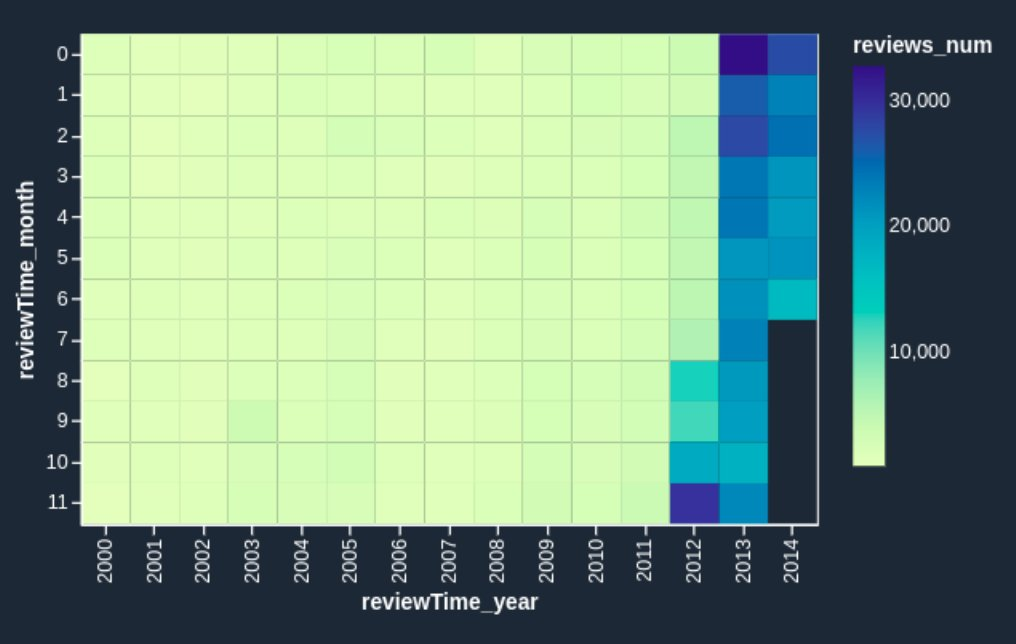\n\nIf you want to enhance the heatmap further, you can slice the data to only show reviews prior to 2011. These are hard to identify in the heatmap we just created due to large volumes of reviews since 2012.\n\n14. Add one line of code to your custom visualization:\n\n\n```\n# Table is available as variable `df`\nimport altair as alt\n\ndf = df[df.reviewTime_year < 2011]\n# Takes first 1000 records of the Dataframe\ndf = df.head(1000) \n\nchart = (\n alt.Chart(df)\n .mark_rect()\n .encode(\n # Specify the column names for X and Y axis,\n # Both should have discrete values: ordinal (:O) or nominal (:N)\n x= \"reviewTime_year:O\",\n y=\"reviewTime_month:O\",\n # Color can be both discrete (:O, :N) and quantitative (:Q)\n color=\"reviews_num:Q\",\n )\n .interactive()\n)\n```\nWe get the following heatmap.\n\n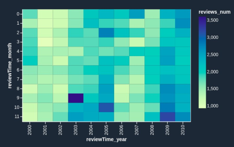\n\nNow the heatmap reflects the reviews prior to 2011 more visibly: we can observe the seasonal effects (the end of the year brings more purchases and therefore more reviews) and can identify anomalous months, such as October 2003 and March 2005. It’s worth investigating further to determine the cause of those anomalies.\n\n#### **Conclusion**\n\nData Wrangler is a purpose-built data aggregation and preparation tool for ML. In this post, we demonstrated how to perform EDA and transform your data quickly using code snippets provided by Data Wrangler. You just need to find a snippet, enter the code, and adjust the parameters to match your dataset. You can continue to iterate on your script to create more complex visualizations and transforms.\nTo learn more about Data Wrangler, refer to [Create and Use a Data Wrangler Flow](https://docs.aws.amazon.com/sagemaker/latest/dg/data-wrangler-data-flow.html).\n\n#### **About the Authors**\n\n\n\n**Nikita Ivkin** is an Applied Scientist, Amazon SageMaker Data Wrangler.\n\n\n\n**Haider Naqvi** is a Solutions Architect at AWS. He has extensive software development and enterprise architecture experience. He focuses on enabling customers to achieve business outcomes with AWS. He is based out of New York.\n\n\n\n**Harish Rajagopalan** is a Senior Solutions Architect at Amazon Web Services. Harish works with enterprise customers and helps them with their cloud journey.\n\n\n\n**James Wu** is a Senior AI/ML Specialist SA at AWS. He works with customers to accelerate their cloud journey and fast-track their business value realization. In addition to that, James is also passionate about developing and scaling large AI/ ML solutions across various domains. Prior to joining AWS, he led a multi-discipline innovation technology team with ML engineers and software developers for a top global firm in the market and advertising industry.\n\n\n","render":"<p><a href=\"https://aws.amazon.com/sagemaker/data-wrangler/\" target=\"_blank\">Amazon SageMaker Data</a> Wrangler is a purpose-built data aggregation and preparation tool for machine learning (ML). It allows you to use a visual interface to access data and perform exploratory data analysis (EDA) and feature engineering. The EDA feature comes with built-in data analysis capabilities for charts (such as scatter plot or histogram) and time-saving model analysis capabilities such as feature importance, target leakage, and model explainability. The feature engineering capability has over 300 built-in transforms and can perform custom transformations using either Python, PySpark, or Spark SQL runtime.</p>\n<p>For custom visualizations and transforms, Data Wrangler now provides example code snippets for common types of visualizations and transforms. In this post, we demonstrate how to use these code snippets to quickstart your EDA in Data Wrangler.</p>\n<h4><a id=\"Solution_overview_4\"></a><strong>Solution overview</strong></h4>\n<p>At the time of this writing, you can import datasets into Data Wrangler from <a href=\"http://aws.amazon.com/s3\" target=\"_blank\">Amazon Simple Storage Service</a> (Amazon S3), <a href=\"http://aws.amazon.com/athena\" target=\"_blank\">Amazon Athena</a>, <a href=\"http://aws.amazon.com/redshift\" target=\"_blank\">Amazon Redshift</a>, Databricks, and Snowflake. For this post, we use Amazon S3 to store the 2014 Amazon <a href=\"https://jmcauley.ucsd.edu/data/amazon/links.html\" target=\"_blank\">reviews dataset</a>. The following is a sample of the dataset:</p>\n<pre><code class=\"lang-\">{ "reviewerID": "A2SUAM1J3GNN3B", "asin": "0000013714", "reviewerName": "J. McDonald", "helpful": [2, 3], "reviewText": "I bought this for my husband who plays the piano. He is having a wonderful time playing these old hymns. The music is sometimes hard to read because we think the book was published for singing from more than playing from. Great purchase though!", "overall": 5.0, "summary": "Heavenly Highway Hymns", "unixReviewTime": 1252800000, "reviewTime": "09 13, 2009" } \n</code></pre>\n<p>In this post, we perform EDA using three columns—<code>asin</code>, <code>reviewTime</code>, and <code>overall</code>—which map to the product ID, review time date, and the overall review score, respectively. We use this data to visualize dynamics for the number of reviews across months and years.</p>\n<h4><a id=\"Using_example_Code_Snippet_for_EDA_in_Data_Wrangler_13\"></a><strong>Using example Code Snippet for EDA in Data Wrangler</strong></h4>\n<ol>\n<li>Download the <a href=\"http://snap.stanford.edu/data/amazon/productGraph/categoryFiles/reviews_Digital_Music.json.gz\" target=\"_blank\">Digital Music reviews dataset</a> JSON and upload it to Amazon S3.<br />\nWe use this as the raw dataset for the EDA.</li>\n<li>Open <a href=\"https://docs.aws.amazon.com/sagemaker/latest/dg/studio.html\" target=\"_blank\">Amazon SageMaker Studio</a> and create a new Data Wrangler flow and import the dataset from Amazon S3.</li>\n</ol>\n<p><video src=\"https://dev-media.amazoncloud.cn/f6e81eec19944aeaa09636ab446b3b4c_1.mp4\" controls=\"controls\"></video></p>\n<p>This dataset has nine columns, but we only use three: asin, reviewTime, and overall. We need to drop the other six columns.</p>\n<ol start=\"3\">\n<li>Create a custom transform and choose Python (PySpark).</li>\n<li>Expand Search example snippets and choose Drop all columns except several.</li>\n<li>Enter the provided snippet into your custom transform and follow the directions to modify the code</li>\n</ol>\n<pre><code class=\"lang-\"># Specify the subset of columns to keep\ncols = ["asin", "reviewTime", "overall"]\n\ncols_to_drop = set(df.columns).difference(cols) \ndf = df.drop(*cols_to_drop)\n</code></pre>\n<p><video src=\"https://dev-media.amazoncloud.cn/3a7004d0fb8545b38b28abad13bbfcfd_2.mp4\" controls=\"controls\"></video></p>\n<p>Now that we have all the columns we need, let’s filter the data down to only keep reviews between 2000–2020.</p>\n<ol start=\"6\">\n<li>Use the Filter timestamp outside range snippet to drop the data before year 2000 and after 2020.</li>\n</ol>\n<pre><code class=\"lang-\">from pyspark.sql.functions import col\nfrom datetime import datetime\n# specify the start and the stop timestamp\ntimestamp_start = datetime.strptime("2000-01-01 12:00:00", "%Y-%m-%d %H:%M:%S")\ntimestamp_stop = datetime.strptime("2020-01-01 12:00:00", "%Y-%m-%d %H:%M:%S")\n\ndf = df.filter(col("reviewTime").between(timestamp_start, timestamp_stop))\n</code></pre>\n<p><video src=\"https://dev-media.amazoncloud.cn/017eaef725fe47b685d5fd202e0ce2f7_3.mp4\" controls=\"controls\"></video><br />\nNext, we extract the year and month from the reviewTime column.</p>\n<ol start=\"7\">\n<li>Use the Featurize date/time transform.</li>\n<li>For Extract columns, choose year and month.</li>\n</ol>\n<p><video src=\"https://dev-media.amazoncloud.cn/f2b0828f894848f3a8737fe4c42af09f_4.mp4\" controls=\"controls\"></video></p>\n<p>Next, we want to aggregate the number of reviews by year and month that we created in the previous step.</p>\n<ol start=\"9\">\n<li>Use the Compute statistics in groups snippet.</li>\n</ol>\n<pre><code class=\"lang-\"># Table is available as variable `df`\nfrom pyspark.sql.functions import sum, avg, max, min, mean, count\n\n# Provide the list of columns defining groups\ngroupby_cols = ["reviewTime_year", "reviewTime_month"]\n\n# Specify the map of aggregate function to the list of colums\n# aggregates to use: sum, avg, max, min, mean, count\naggregate_map = {count: ["overall"]}\n\nall_aggregates = []\nfor a, cols in aggregate_map.items():\n all_aggregates += [a(col) for col in cols]\n\ndf = df.groupBy(groupby_cols).agg(*all_aggregates)\n</code></pre>\n<p><video src=\"https://dev-media.amazoncloud.cn/0892757c925549749c6856bb0236aa56_5.mp4\" controls=\"controls\"></video></p>\n<ol start=\"10\">\n<li>Rename the aggregation of the previous step from count(overall) to reviews_num by choosing Manage Columns and the Rename column transform.<br />\nFinally, we want to create a heatmap to visualize the distribution of reviews by year and by month.</li>\n<li>On the analysis tab, choose Custom visualization.</li>\n<li>Expand Search for snippet and choose Heatmap on the drop-down menu.</li>\n<li>Enter the provided snippet into your custom visualization:</li>\n</ol>\n<p><video src=\"https://dev-media.amazoncloud.cn/a1966a90617546638b4c1b9497c99288_6.mp4\" controls=\"controls\"></video></p>\n<pre><code class=\"lang-\"># Table is available as variable `df`\n# Table is available as variable `df`\nimport altair as alt\n\n# Takes first 1000 records of the Dataframe\ndf = df.head(1000) \n\nchart = (\n alt.Chart(df)\n .mark_rect()\n .encode(\n # Specify the column names for X and Y axis,\n # Both should have discrete values: ordinal (:O) or nominal (:N)\n x= "reviewTime_year:O",\n y="reviewTime_month:O",\n # Color can be both discrete (:O, :N) and quantitative (:Q)\n color="reviews_num:Q",\n )\n .interactive()\n)\n</code></pre>\n<p>We get the following visualization.</p>\n<p><img src=\"https://dev-media.amazoncloud.cn/e3d64bbd19464b658b63cc4e7fc50bbd_image.png\" alt=\"image.png\" /></p>\n<p>If you want to enhance the heatmap further, you can slice the data to only show reviews prior to 2011. These are hard to identify in the heatmap we just created due to large volumes of reviews since 2012.</p>\n<ol start=\"14\">\n<li>Add one line of code to your custom visualization:</li>\n</ol>\n<pre><code class=\"lang-\"># Table is available as variable `df`\nimport altair as alt\n\ndf = df[df.reviewTime_year < 2011]\n# Takes first 1000 records of the Dataframe\ndf = df.head(1000) \n\nchart = (\n alt.Chart(df)\n .mark_rect()\n .encode(\n # Specify the column names for X and Y axis,\n # Both should have discrete values: ordinal (:O) or nominal (:N)\n x= "reviewTime_year:O",\n y="reviewTime_month:O",\n # Color can be both discrete (:O, :N) and quantitative (:Q)\n color="reviews_num:Q",\n )\n .interactive()\n)\n</code></pre>\n<p>We get the following heatmap.</p>\n<p><img src=\"https://dev-media.amazoncloud.cn/c231fc35de3f436e9d3d8c4e0e6c7338_image.png\" alt=\"image.png\" /></p>\n<p>Now the heatmap reflects the reviews prior to 2011 more visibly: we can observe the seasonal effects (the end of the year brings more purchases and therefore more reviews) and can identify anomalous months, such as October 2003 and March 2005. It’s worth investigating further to determine the cause of those anomalies.</p>\n<h4><a id=\"Conclusion_146\"></a><strong>Conclusion</strong></h4>\n<p>Data Wrangler is a purpose-built data aggregation and preparation tool for ML. In this post, we demonstrated how to perform EDA and transform your data quickly using code snippets provided by Data Wrangler. You just need to find a snippet, enter the code, and adjust the parameters to match your dataset. You can continue to iterate on your script to create more complex visualizations and transforms.<br />\nTo learn more about Data Wrangler, refer to <a href=\"https://docs.aws.amazon.com/sagemaker/latest/dg/data-wrangler-data-flow.html\" target=\"_blank\">Create and Use a Data Wrangler Flow</a>.</p>\n<h4><a id=\"About_the_Authors_151\"></a><strong>About the Authors</strong></h4>\n<p><img src=\"https://dev-media.amazoncloud.cn/076ae58b0d51415981f0ff4fcf0d4984_image.png\" alt=\"image.png\" /></p>\n<p><strong>Nikita Ivkin</strong> is an Applied Scientist, Amazon SageMaker Data Wrangler.</p>\n<p><img src=\"https://dev-media.amazoncloud.cn/4d9404ec94664e98a19d274b61cff7aa_image.png\" alt=\"image.png\" /></p>\n<p><strong>Haider Naqvi</strong> is a Solutions Architect at AWS. He has extensive software development and enterprise architecture experience. He focuses on enabling customers to achieve business outcomes with AWS. He is based out of New York.</p>\n<p><img src=\"https://dev-media.amazoncloud.cn/3750270b121e43f8b2ca46d6d92e77ec_image.png\" alt=\"image.png\" /></p>\n<p><strong>Harish Rajagopalan</strong> is a Senior Solutions Architect at Amazon Web Services. Harish works with enterprise customers and helps them with their cloud journey.</p>\n<p><img src=\"https://dev-media.amazoncloud.cn/4e37527d7cc24f8d8d17e9aed41543bf_image.png\" alt=\"image.png\" /></p>\n<p><strong>James Wu</strong> is a Senior AI/ML Specialist SA at AWS. He works with customers to accelerate their cloud journey and fast-track their business value realization. In addition to that, James is also passionate about developing and scaling large AI/ ML solutions across various domains. Prior to joining AWS, he led a multi-discipline innovation technology team with ML engineers and software developers for a top global firm in the market and advertising industry.</p>\n"}
Prepare data faster with PySpark and Altair code snippets in Amazon SageMaker Data Wrangler
海外精选

海外精选的内容汇集了全球优质的亚马逊云科技相关技术内容。同时,内容中提到的“AWS”
是 “Amazon Web Services” 的缩写,在此网站不作为商标展示。

 0
0 0
0亚马逊云科技解决方案 基于行业客户应用场景及技术领域的解决方案
联系亚马逊云科技专家
亚马逊云科技解决方案
基于行业客户应用场景及技术领域的解决方案
联系专家

0
目录

 分享
分享 点赞
点赞 收藏
收藏 目录
目录立即注册,开启您的免费套餐
立即关注

亚马逊云开发者
公众号

User Group
公众号

亚马逊云科技
官方小程序
“AWS” 是 “Amazon Web Services” 的缩写,在此网站不作为商标展示。
立即关注
亚马逊云开发者
公众号
User Group
公众号
亚马逊云科技
官方小程序
“AWS” 是 “Amazon Web Services” 的缩写,在此网站不作为商标展示。
关于我们 
更多资源
开发者工具
更多支持
立即关注
亚马逊云开发者
公众号
User Group
公众号
亚马逊云科技
官方小程序
“AWS” 是 “Amazon Web Services” 的缩写,在此网站不作为商标展示。
