{"value":"[Amazon QuickSight](https://quicksight.aws/) was launched in November 2016 as a fast, cloud-powered business analytics service to build visualizations, perform ad hoc analysis, and quickly get business insights from a variety of data sources. In 2018, ML Insights for QuickSight (Enterprise Edition) was announced to add machine learning (ML)-powered forecasting and anomaly detection with a few clicks. These insights are automatically generated as suggested insights, and you can also add custom insights to your analysis. Because they’re written out in narrative format, they’re easily consumable by any non-technical user and are a great way to increase adoption of your dashboards. Let’s dive deeper on how these insights are built and how to correctly set up your data to maximize the Suggested Insights feature.\n\n#### **What are ML Insights?**\nQuickSight uses ML to help uncover hidden insights and trends in your data. It does that by using an ML model that over time and with an increasing volume of data being fed into QuickSight, continually learns and improves its abilities to provide three key features (as of this writing):\n- **ML-powered anomaly detection** – Detect outliers that show significant variance from the dataset. This can help identify significant changes in your business metrics such has low-performing stores or products, or top selling items.\n- **ML-powered forecasting** – Detect trends and seasonality to forecast based on historical data. This can help project sales, orders, website traffic, and more.\n- **Autonarratives** – Embed narratives in your dashboard to tell the story of your data in plain language. This can help convey a shared understanding of the data within your organization. You can use either the suggested autonarrative or you can customize the computations and language to meet your organization’s unique requirements.\n\n#### **How does the ML model work?**\nQuickSight uses a built-in version of the Random Cut Forest (RCF) algorithm. This is a special type of Random Forest (RF) algorithm, a widely used and successful technique in ML. It takes a set of random data points, cuts them down to the same number of points, and then builds a collection of models. In contrast, a model corresponds to a decision tree—thereby the name “forest.” Because RFs can’t be easily updated in an incremental manner, RCFs were invented with variables in tree construction that were designed to allow incremental updates.\n\nThe key takeaway is that RCF is great for finding anomalies and building forecasts. This algorithm is good at finding data points that are outliers or finding trends and patterns to forecast future values.\n\nOne important thing to know about ML models is that each model is good at a certain set of predictive activities, but no one model is good for all activities.\n\nNow that you understand what the RCF model is good at, namely anomaly detection and forecasting, you need to make sure the data meets certain requirements, so let’s walk through those steps.\n\n#### **Best practices for setting up data**\nTo maximize the RCF model’s efficiency, the data that is being imported needs to contain certain properties:\n- **At least one metric** – Whatever you’re measuring (sold units, orders, and so on).\n- **At least one dimension** – The category or slice by which you look at the metric (product category, industry, customer type, and so on).\n- **Data volumes** – Your [dataset requirements](https://docs.aws.amazon.com/quicksight/latest/user/ml-data-set-requirements.html) depend on your objective:\n\t- **Anomaly detection** – Requires at least 15 data points. For example, if you have ```Bicycles``` as a product category and want to detect anomalies at a daily level, you need at least 15 days of transactions (you could have multiple rows for multiple transactions in a given day) for ```Bicycles``` in the dataset.\n\t- **Forecasting** – This works best with a large dataset simply because the more history you have, the better the model can extract patterns and trends and generate future probable values. If you have daily aggregates, you need at least 38 days of data.\n- **At least one date column** – If we want to analyze anomalies or forecasts in the dataset.\n\nQuickSight supports a wide variety of connections, like [Amazon Simple Storage Service](http://aws.amazon.com/s3) (Amazon S3), [Amazon Athena](http://aws.amazon.com/athena), and Apache Spark. For more information about supported connections and some connection examples, refer to [Amazon QuickSight Connection examples](https://docs.aws.amazon.com/quicksight/latest/user/connecting-to-data-examples.html).\n\n#### **Get started with Suggested Insights**\nLet’s use a sample dataset and walk through an example of how to use the Suggested Insights feature.\n\nTo get started, let’s download a sample dataset from the public domain. For this post, we use [House Sales in King County,USA.](https://www.kaggle.com/datasets/harlfoxem/housesalesprediction) You need to have a Kaggle account to download the resource.\n\n1.Download and unzip the file.\nIf you inspect the CVS file, you will notice it has the right grain (```date```), metrics (```price```, ```bedrooms```) and categories (```zipcode```, ```waterfront```).\n\n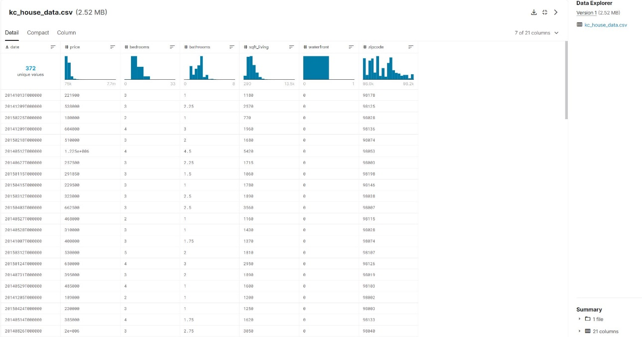\n\t\nDepending on what your analysis needs are, even bedrooms could be a category by which you analyze price. So your metrics and categories ultimately depend on your analysis goals.\n\n2.Log in to your QuickSight account or sign up for a QuickSight Enterprise Edition account to use ML Insights.\nWe need to create a dataset first before we can create a QuickSight analysis.\n\n3.Choose **New dataset**.\n4.Choose **Upload a file**.\n\n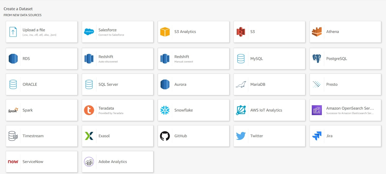\n\n5.Choose the unzipped CSV file.\n6.In the pop-up window, confirm the file upload settings, then choose **Edit settings and prepare data**.\n\n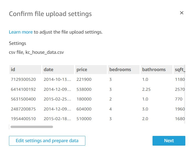\n\nYou’re redirected to the data preparation editor. This is one of the most important yet overlooked functions in QuickSight.\n\n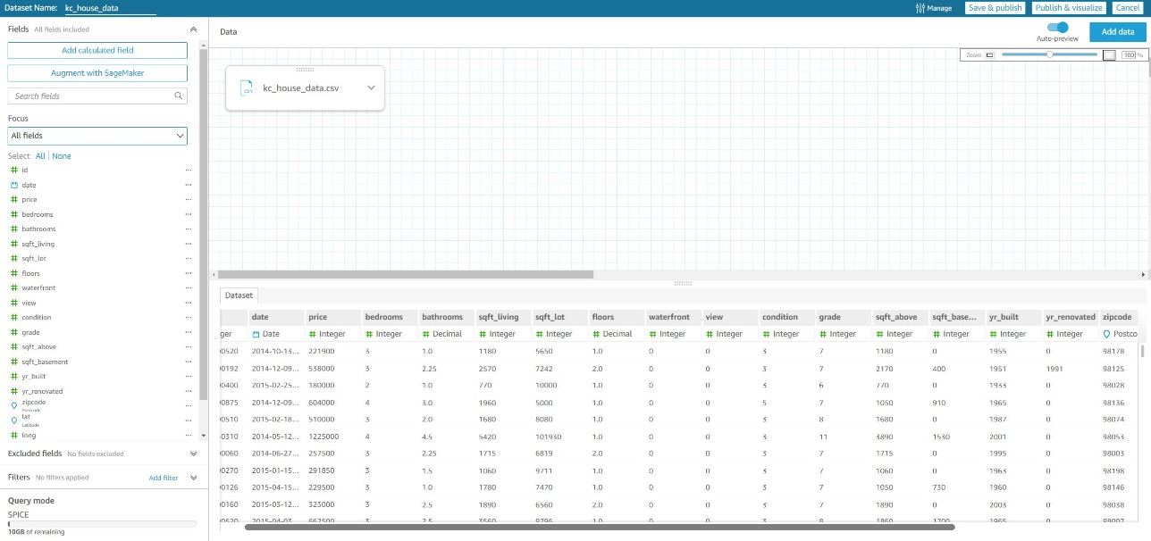\n\nThis editor allows you to review your imported fields and their data types, specify if the field will be used as a [dimension or measure](https://docs.aws.amazon.com/quicksight/latest/user/setting-dimension-or-measure.html), along with many other important data import functions. For production datasets, you should spend time reviewing how the dataset has been set up here.\n\nFor our sample CSV file, it’s imported into a QuickSight SPICE by default. SPICE is an in-memory engine for fast querying of imported data. For more details, see [Importing data into SPICE](https://docs.aws.amazon.com/quicksight/latest/user/spice.html).\n\n7.Choose **Save & publish** to start importing the CSV file into the SPICE engine.\nThe default dataset name is the file name that was imported, so in our case it’s ```kc_house_data```. You can choose the dataset on the **Datasets** page to see the import stats for the dataset.\n\n8.Choose **Create analysis** to start creating your QuickSight analysis.\n\n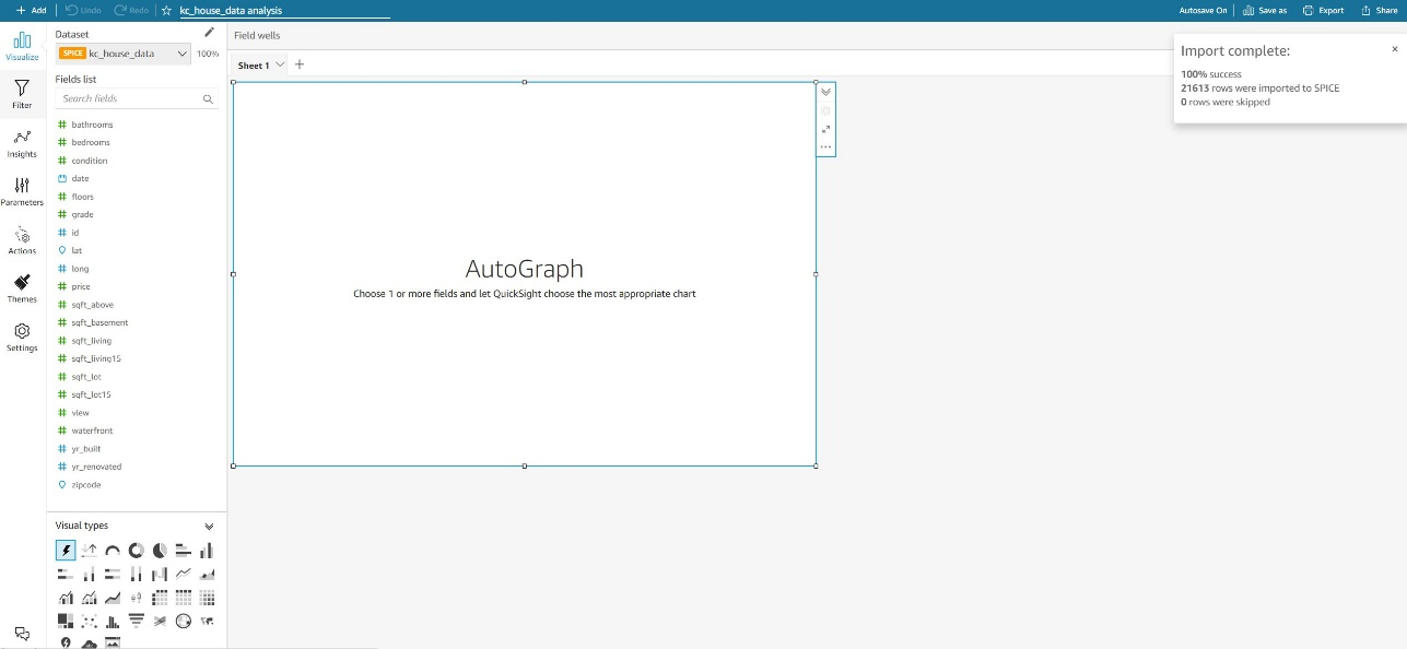\n\nThe analysis editor page starts by showing a blank Sheet 1 on your workspace. On the top right, your dataset’s import stats are shown again (this becomes important when importing or refreshing large datasets because the import job might still be in progress).\n\nLet’s start by creating our first visual. The default visual type is AutoGraph, which will try to pick the best visual type based on the fields being selected.\n\n9.Choose the ```date``` field.\nThe visual changes to **Count of Records by Date**, with the date aggregation set to **Day**.\n\n10.To change the aggregation to monthly, choose the down arrow next to **date** on the X axis.\n\n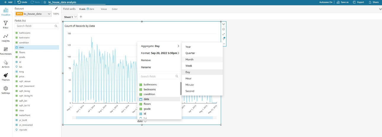\n\n11.Choose the ```price``` field.\nThe AutoGraph detects that the date is a dimension (blue color) and the price is a measure (green color) because these were set up like that in the dataset editor screen (I mentioned earlier how important the data preparation editor was).\n\nBecause these fields are already set up as dimensions and measures, the AutoGraph automatically changes to **Sum of Price by Date**.\n\n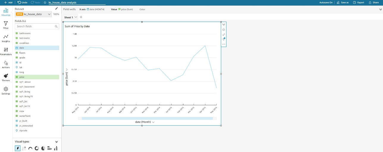\n\nThis visualization isn’t very helpful. What we’re really looking for is the average price per month.\n\n12.For **Field wells**, choose **price for Value** and change the aggregate to **Average**.\nWe now have a nice visual that shows us the average sale price of homes in Kings County by month.\n\nNow comes the fun part—ML **Insights**!\n\n13.In the navigation pane, choose Insights.\nVoila! QuickSight has already run the RCF model along with other statistical computations and has generated insights that are ready to be added.\n\n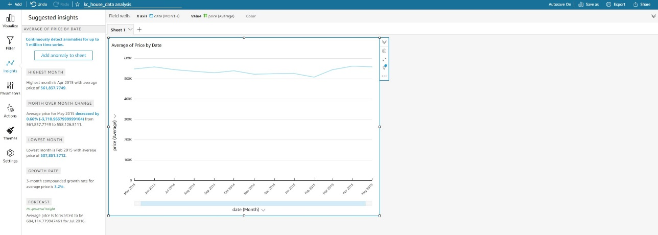\n\nThese suggested insights change based on the type of visual and data that is currently in the visual. We look at how suggested insights change later in this post.\n\nTwo immediately useful insights are **Highest Month** and **Lowest Month**.\n\nHover over the **Highest Month** insight and choose the plus sign to add it to the current Sheet 1.\n\n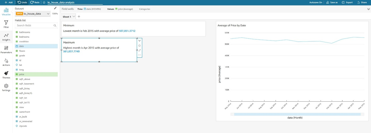\n\nI can start rearranging insights and visuals and format the ```price``` field to give my current layout a more polished look.\n\n14.For this post, change the format of the ```price``` field to 1,2345 to remove decimals.\n15.You can also add titles for the insights and rename the X axis label **date** to **Aggregate**.\n\n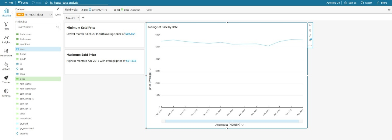\n\n16.To add another sheet, choose the plus sign next to Sheet 1.\nBy default, we start again with an AutoGraph visual.\n\n17.Under **Visual types**¸ choose the vertical bar chart.\n18.Choose the ```price``` and ```zipcode``` fields.\n19.Change the aggregation of price from **Sum** to **Average**.\n20.Choose **Insights** in the navigation pane.\n\n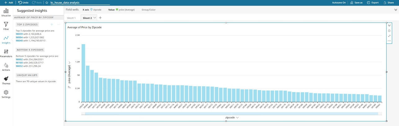\n\nSuggested Insights now displays a completely different set of data highlights compared to Sheet 1.\n\nAlthough the vertical bar chart may already tell you the top three and bottom three zip codes, Suggested Insights already recognized the type of analysis and selected the best insights to display.\n\nAlthough you might eventually build a visual to portray the intended story, Suggested Insights speeds up the process of showcasing the highlights in your data and adding them to your worksheet to quickly give the reader the most important insights from your visuals.\n\n#### **Anomaly detection**\nAn anomaly in QuickSight is described a data point that fall outside an overall pattern of distribution. ML-powered anomaly detection in QuickSight enables you to identify the causations and correlations to make data-driven decisions.\n\nWe already talked about data preparation for anomaly detection earlier. QuickSight already ran the RCF model during data import. As soon as a visual is added, QuickSight notifies you on the visual if it has detected an “Anomaly Insight.” This part of Suggested Insights. You can choose **Setup anomaly detection** to add this to your sheet.\n\n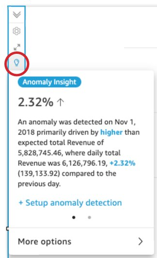\n\nYou can also manually add an ML insight to detect anomalies.\n1. Let’s go back to Sheet 1 with the line chart displayed.\n2. When you choose the first suggested insight, it starts creating a widget for anomaly detection.\n\n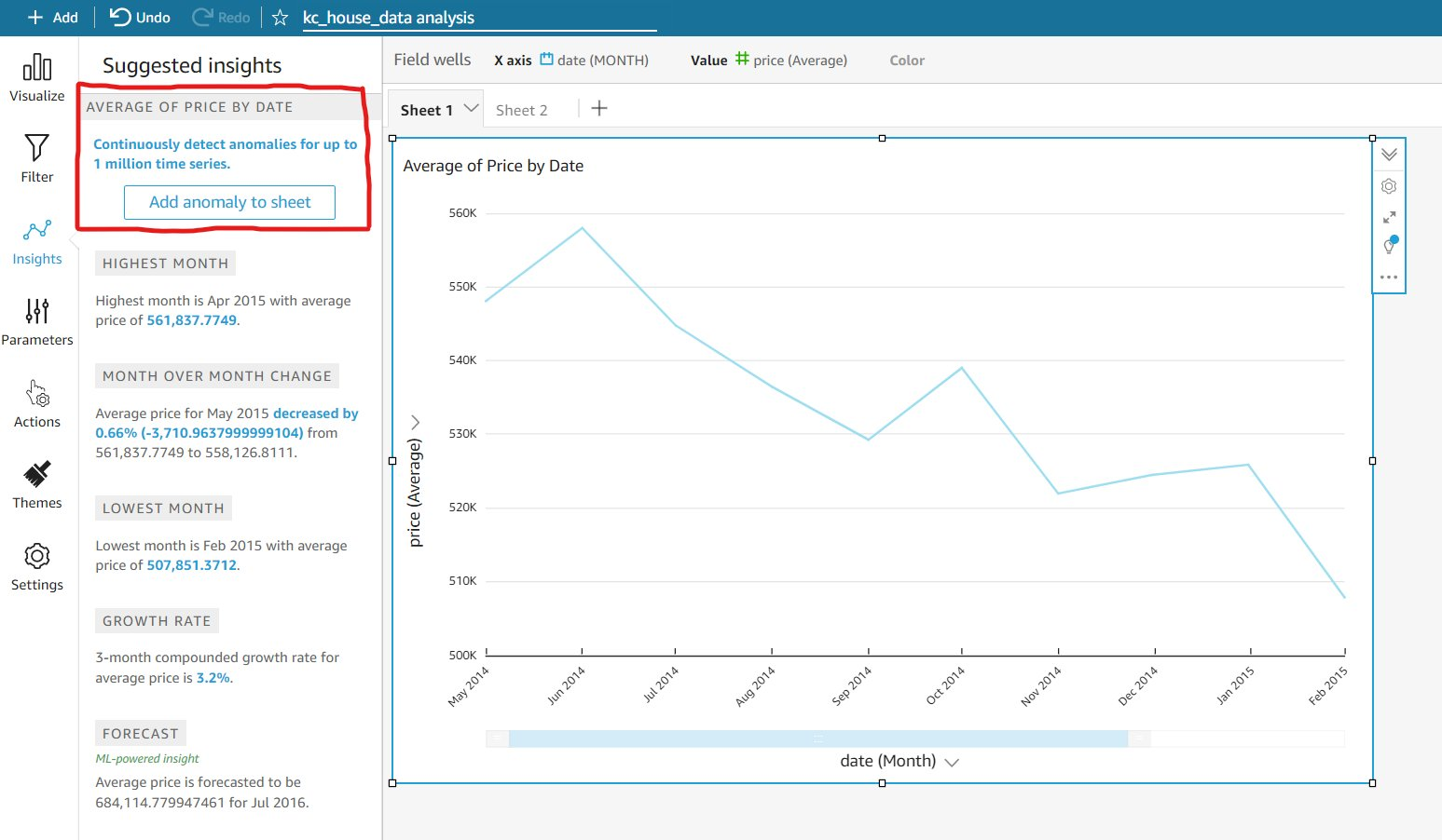\n\nYou can add up to five dimensions fields (not calculated fields, unless they were created in the data prep screen). QuickSight splits the metrics using the fields in the **Categories** section. We use the ```date``` field (our time dimension), ```price``` (our metric), and ```yr_built``` (our category) to create an anomaly detection insight. The question we are trying to answer is “Were there any monthly outliers in price based on the year built?”\n\n3.Choose **Get started** to set up anomaly detection.\n\n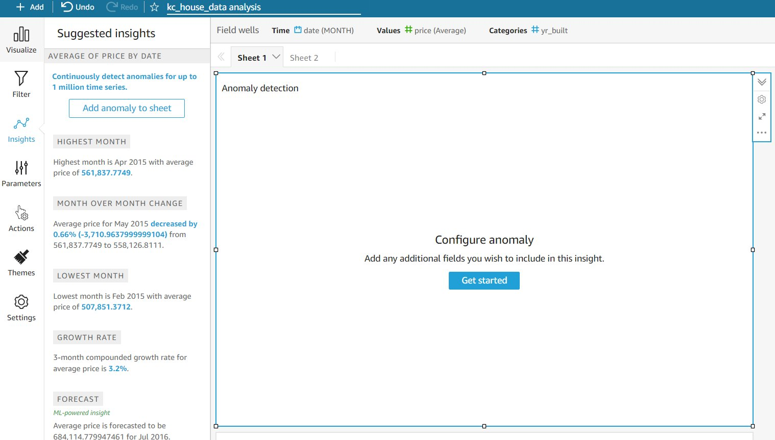\n\n4.For **Combinations to be analyzed**, choose your field combinations.\n\nChoosing **Exact** means that the date and price are analyzed against the ```yr_built``` dimension. You can also choose **Hierarchical** or **All**. These latter options become relevant when you choose multiple dimensions in the Categories list. For more information about these options, refer to [Adding an ML insight to detect outliers and key drivers](https://docs.aws.amazon.com/quicksight/latest/user/anomaly-detection-adding-anomaly-insights.html).\n\n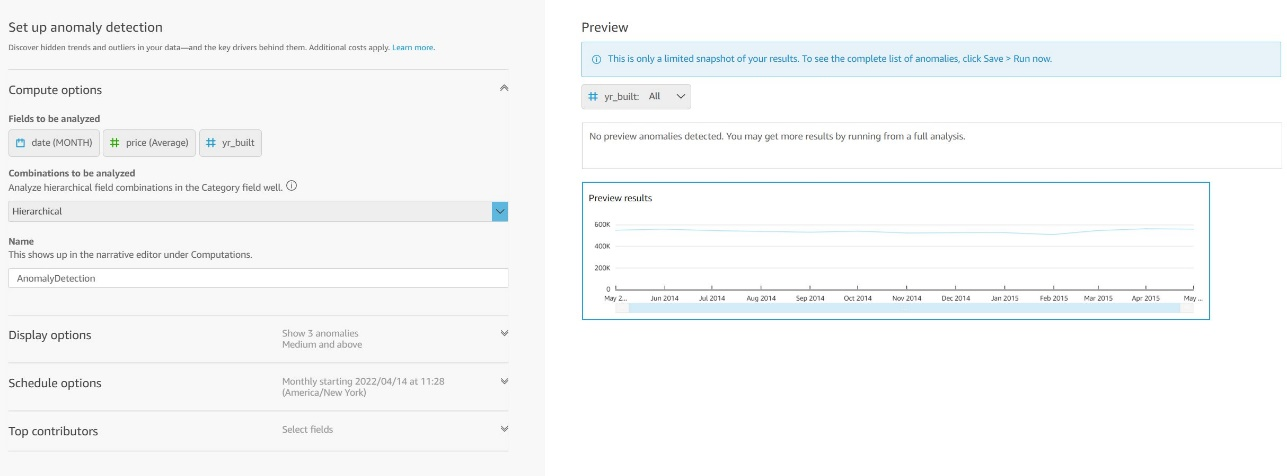\n\n5.Choose **Save** to return to Sheet 1.\nOur widget is configured at this point.\n\n6.Choose **Run now** to start analyzing the data for anomalies.\n\nBased on the volume of data and the number of data points in the analysis, it may take a while to run the anomaly detection.\n\nKeep in mind that at least 15 data points are needed to run an anomaly, but then you can change the aggregation of a field to have a zoom-out view and therefore view anomalies at a higher level.\n\nFor example, if you choose the ```date``` field and change **Aggregate** to **Monthly**, you get the top anomalies at the monthly level.\n\n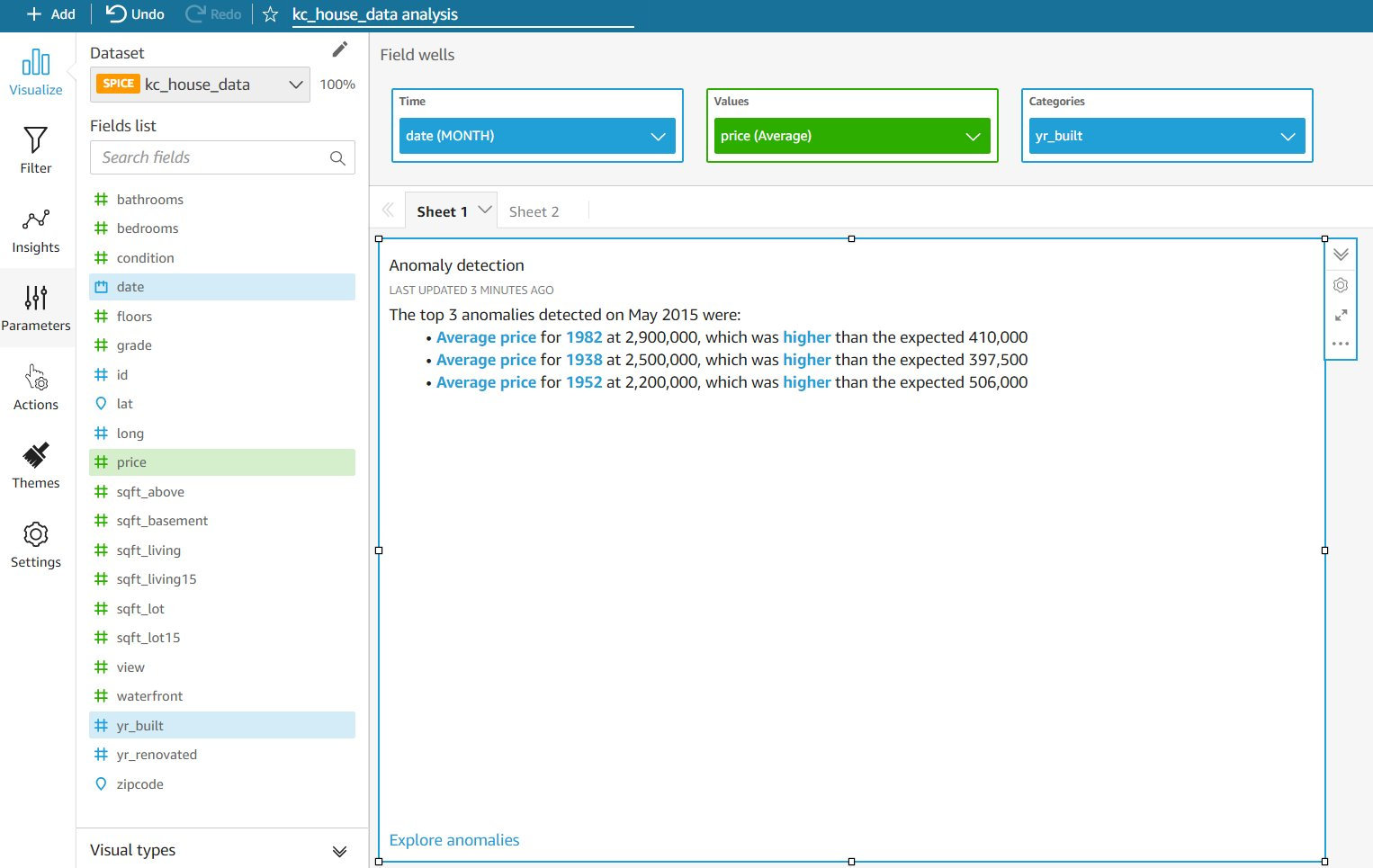\n\nIn our test case, QuickSight identified a top anomaly. This is a great widget that immediately draws the reader to highlights in data that are outliers and might require further investigation.\n\n#### **Forecast**\nWith ML-powered forecasting, you can forecast your key business metrics in QuickSight easily. The ML algorithm in QuickSight is designed to handle complex real-world scenarios. Not only does QuickSight provide the capability to create forecasts, it also provides Forecast as a Suggested Insight.\n\n1.Going back to Sheet 1, choose the line chart and expand **Insights**.\nAt the bottom you will see a suggested forecast insight. Forecast insights, along with all other suggested insights, are dynamic in the sense that when your data updates or when a user applies filters, the values in the insight will update immediately. Once you add this to your sheet you can even customize how many periods in the future you want the insight to display for the forecast by editing the Narrative and then editing the forecast Calculation.\n\n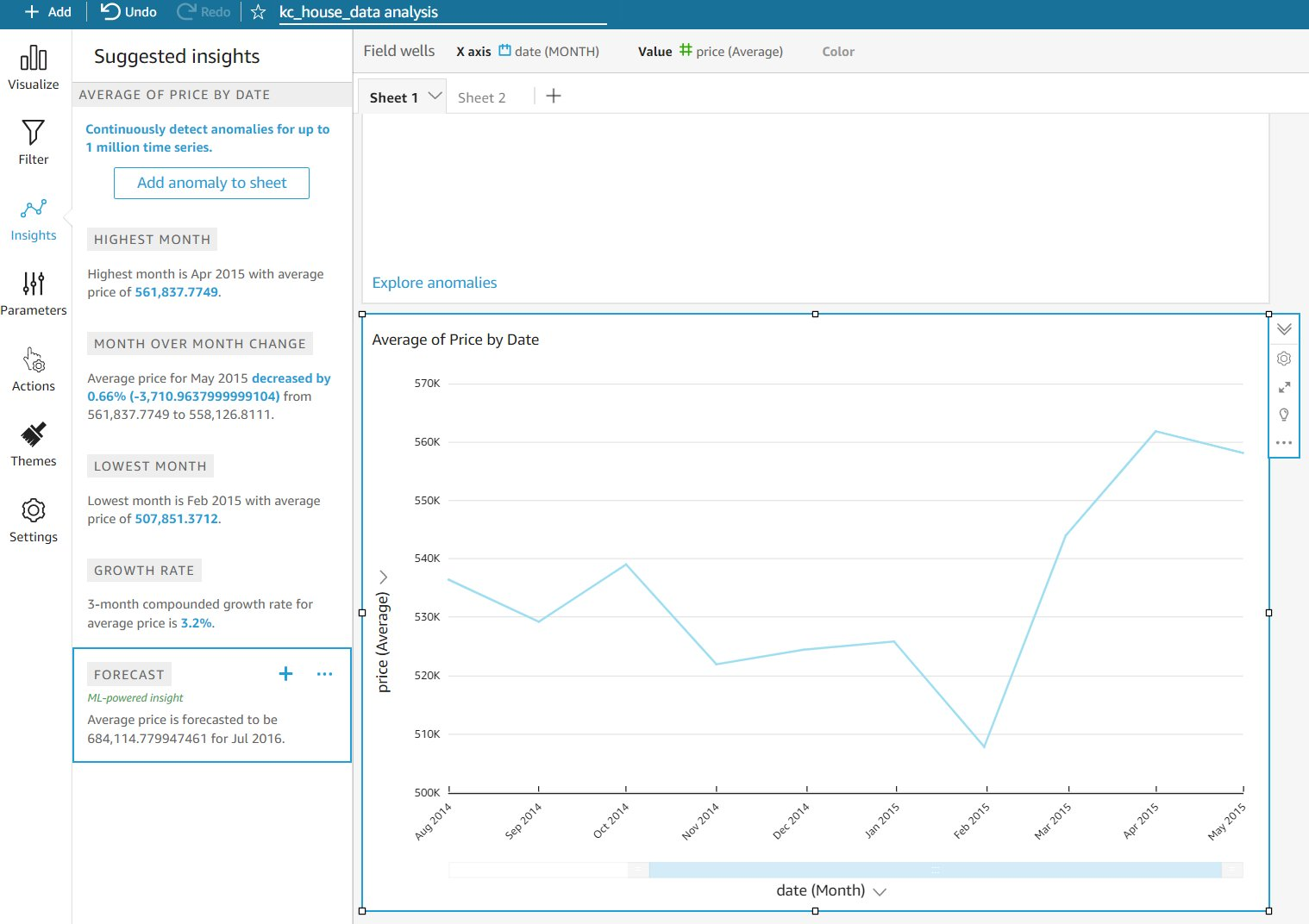\n\nWhat if we wanted to customize the price forecasting on this line chart and add it in the visual?\n\n2.Choose the options menu (three dots) at the top right of the visual and choose **Add forecast**.\n\n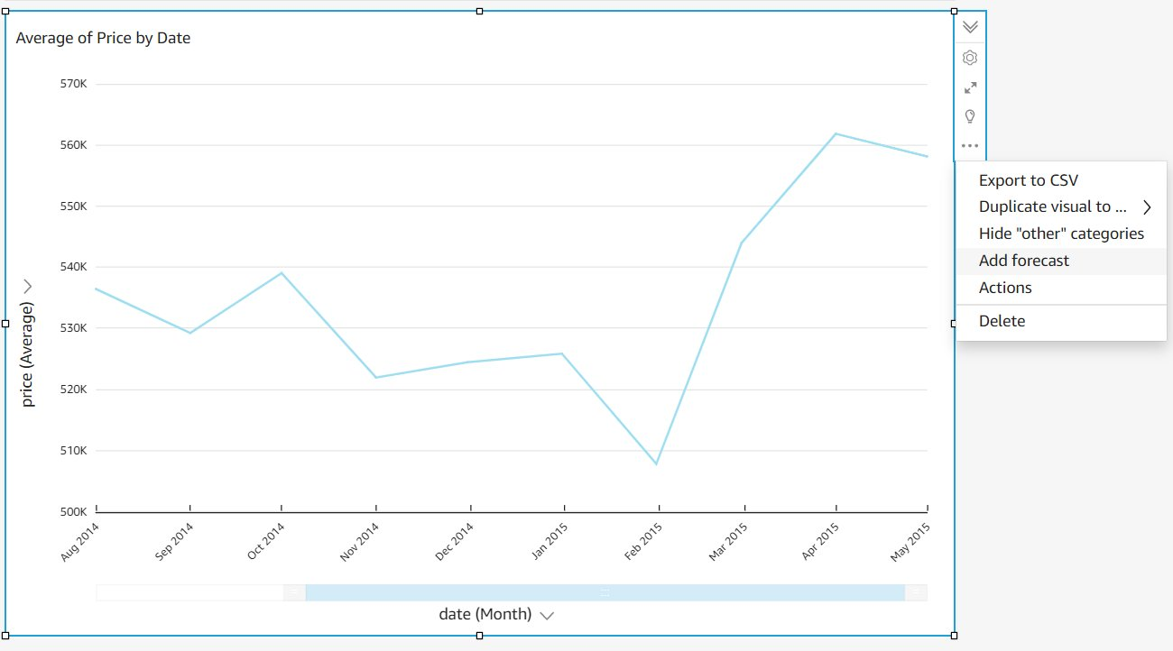\n\n3.For Periods forward, enter ```6```.\nThat is the time interval selected for the visual.\n\n4.Set **Prediction interval** to 70.\nThis is the amount of interval between data points. It causes the forecast to either go wider or narrower. A wider interval means wider gaps between data points, which means the net change is higher, and vice versa.\n\n5.Leave** Seasonality** set to **Automatic**.\nSeasonality takes into account complex seasonal trends in your data. You can experiment with both settings to see how it affects the forecast. For our scenario, because house sales are seasonal, we chose Automatic.\n\n6.Choose **Apply**.\nWith just a few clicks, we have added a forecast to our visual, as shown in the following screenshot. The orange shaded area represents the upper and lower bound of the forecasted price.\n\n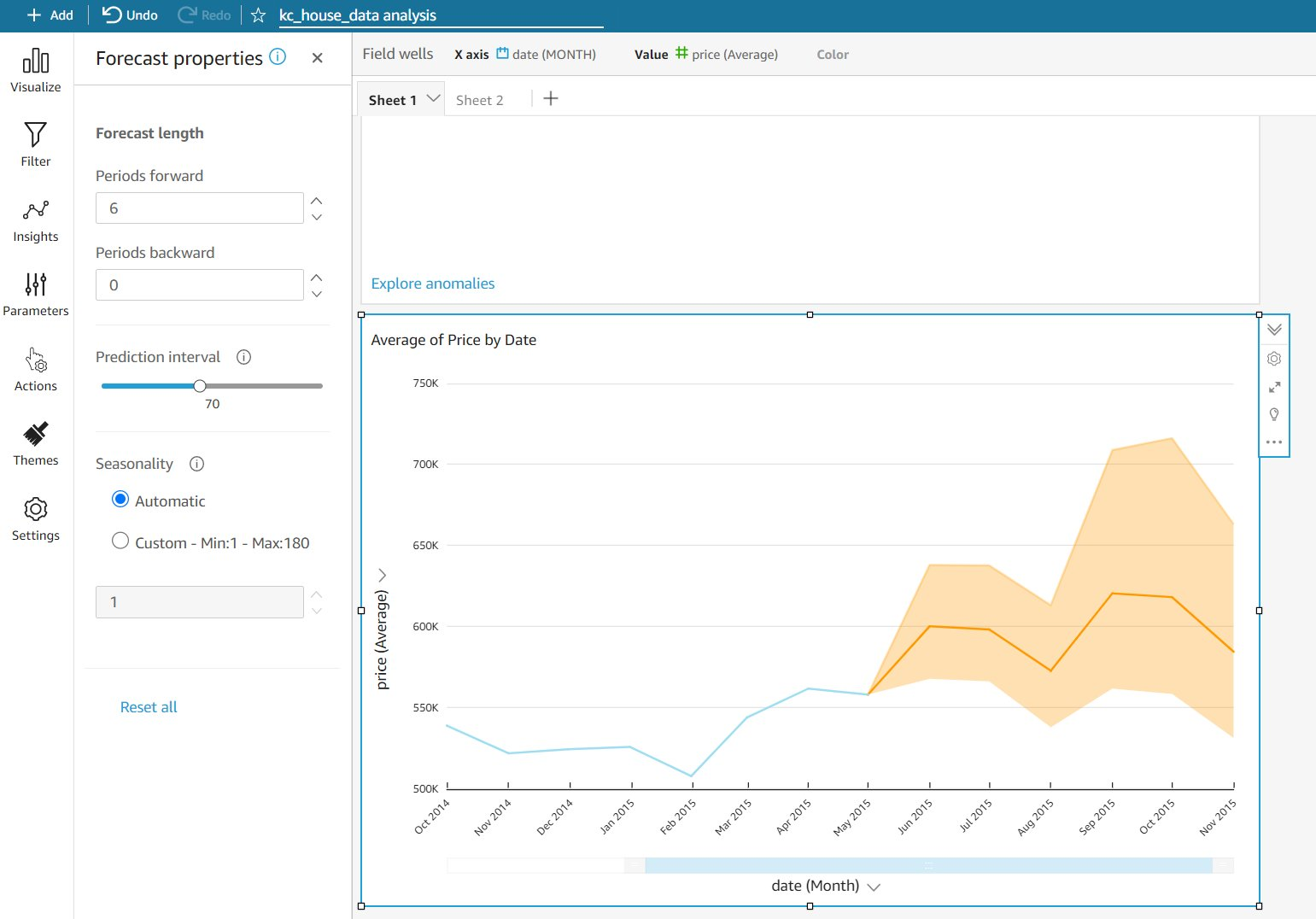\t\n\nThis is another great way to add intelligence to your data and quickly let analysts focus on key data points and trends.\n\n#### **Conclusion**\nThe Suggested Insights feature in QuickSight allows you to speed up the discovery and highlighting of key data elements. You can find insights in your data faster, and because they’re written out in narrative format, they’re very easy for non-technical users to quickly gain insight into the most interesting trends in the data with no ML training needed.\n\nFor more details on QuickSight ML Insights, refer to the [QuickSight documentation](https://docs.aws.amazon.com/quicksight/index.html) or interact with the [QuickSight Community](https://community.amazonquicksight.com/).\n\nAs always, AWS is customer obsessed and we are ready to help with any specific questions.\n\n##### **About the Author**\n\n\n\nRashid Sajjad is a Partner Management Solutions Architect focused on Big Data & Analytics with Amazon Web Services. He works with APN Partners to help develop their Migration, Data & Analytics and AI/ML Practices with enterprise, mission critical solutions for their end customers.r","render":"<p><a href=\"https://quicksight.aws/\" target=\"_blank\">Amazon QuickSight</a> was launched in November 2016 as a fast, cloud-powered business analytics service to build visualizations, perform ad hoc analysis, and quickly get business insights from a variety of data sources. In 2018, ML Insights for QuickSight (Enterprise Edition) was announced to add machine learning (ML)-powered forecasting and anomaly detection with a few clicks. These insights are automatically generated as suggested insights, and you can also add custom insights to your analysis. Because they’re written out in narrative format, they’re easily consumable by any non-technical user and are a great way to increase adoption of your dashboards. Let’s dive deeper on how these insights are built and how to correctly set up your data to maximize the Suggested Insights feature.</p>\n<h4><a id=\"What_are_ML_Insights_2\"></a><strong>What are ML Insights?</strong></h4>\n<p>QuickSight uses ML to help uncover hidden insights and trends in your data. It does that by using an ML model that over time and with an increasing volume of data being fed into QuickSight, continually learns and improves its abilities to provide three key features (as of this writing):</p>\n<ul>\n<li><strong>ML-powered anomaly detection</strong> – Detect outliers that show significant variance from the dataset. This can help identify significant changes in your business metrics such has low-performing stores or products, or top selling items.</li>\n<li><strong>ML-powered forecasting</strong> – Detect trends and seasonality to forecast based on historical data. This can help project sales, orders, website traffic, and more.</li>\n<li><strong>Autonarratives</strong> – Embed narratives in your dashboard to tell the story of your data in plain language. This can help convey a shared understanding of the data within your organization. You can use either the suggested autonarrative or you can customize the computations and language to meet your organization’s unique requirements.</li>\n</ul>\n<h4><a id=\"How_does_the_ML_model_work_8\"></a><strong>How does the ML model work?</strong></h4>\n<p>QuickSight uses a built-in version of the Random Cut Forest (RCF) algorithm. This is a special type of Random Forest (RF) algorithm, a widely used and successful technique in ML. It takes a set of random data points, cuts them down to the same number of points, and then builds a collection of models. In contrast, a model corresponds to a decision tree—thereby the name “forest.” Because RFs can’t be easily updated in an incremental manner, RCFs were invented with variables in tree construction that were designed to allow incremental updates.</p>\n<p>The key takeaway is that RCF is great for finding anomalies and building forecasts. This algorithm is good at finding data points that are outliers or finding trends and patterns to forecast future values.</p>\n<p>One important thing to know about ML models is that each model is good at a certain set of predictive activities, but no one model is good for all activities.</p>\n<p>Now that you understand what the RCF model is good at, namely anomaly detection and forecasting, you need to make sure the data meets certain requirements, so let’s walk through those steps.</p>\n<h4><a id=\"Best_practices_for_setting_up_data_17\"></a><strong>Best practices for setting up data</strong></h4>\n<p>To maximize the RCF model’s efficiency, the data that is being imported needs to contain certain properties:</p>\n<ul>\n<li><strong>At least one metric</strong> – Whatever you’re measuring (sold units, orders, and so on).</li>\n<li><strong>At least one dimension</strong> – The category or slice by which you look at the metric (product category, industry, customer type, and so on).</li>\n<li><strong>Data volumes</strong> – Your <a href=\"https://docs.aws.amazon.com/quicksight/latest/user/ml-data-set-requirements.html\" target=\"_blank\">dataset requirements</a> depend on your objective:\n<ul>\n<li><strong>Anomaly detection</strong> – Requires at least 15 data points. For example, if you have <code>Bicycles</code> as a product category and want to detect anomalies at a daily level, you need at least 15 days of transactions (you could have multiple rows for multiple transactions in a given day) for <code>Bicycles</code> in the dataset.</li>\n<li><strong>Forecasting</strong> – This works best with a large dataset simply because the more history you have, the better the model can extract patterns and trends and generate future probable values. If you have daily aggregates, you need at least 38 days of data.</li>\n</ul>\n</li>\n<li><strong>At least one date column</strong> – If we want to analyze anomalies or forecasts in the dataset.</li>\n</ul>\n<p>QuickSight supports a wide variety of connections, like <a href=\"http://aws.amazon.com/s3\" target=\"_blank\">Amazon Simple Storage Service</a> (Amazon S3), <a href=\"http://aws.amazon.com/athena\" target=\"_blank\">Amazon Athena</a>, and Apache Spark. For more information about supported connections and some connection examples, refer to <a href=\"https://docs.aws.amazon.com/quicksight/latest/user/connecting-to-data-examples.html\" target=\"_blank\">Amazon QuickSight Connection examples</a>.</p>\n<h4><a id=\"Get_started_with_Suggested_Insights_28\"></a><strong>Get started with Suggested Insights</strong></h4>\n<p>Let’s use a sample dataset and walk through an example of how to use the Suggested Insights feature.</p>\n<p>To get started, let’s download a sample dataset from the public domain. For this post, we use <a href=\"https://www.kaggle.com/datasets/harlfoxem/housesalesprediction\" target=\"_blank\">House Sales in King County,USA.</a> You need to have a Kaggle account to download the resource.</p>\n<p>1.Download and unzip the file.<br />\nIf you inspect the CVS file, you will notice it has the right grain (<code>date</code>), metrics (<code>price</code>, <code>bedrooms</code>) and categories (<code>zipcode</code>, <code>waterfront</code>).</p>\n<p><img src=\"https://dev-media.amazoncloud.cn/734561f6c0d44fd4b8c9ee86487a68ed_image.png\" alt=\"image.png\" /></p>\n<p>Depending on what your analysis needs are, even bedrooms could be a category by which you analyze price. So your metrics and categories ultimately depend on your analysis goals.</p>\n<p>2.Log in to your QuickSight account or sign up for a QuickSight Enterprise Edition account to use ML Insights.<br />\nWe need to create a dataset first before we can create a QuickSight analysis.</p>\n<p>3.Choose <strong>New dataset</strong>.<br />\n4.Choose <strong>Upload a file</strong>.</p>\n<p><img src=\"https://dev-media.amazoncloud.cn/d7be202afe7b4843baaad66c7eea3a28_image.png\" alt=\"image.png\" /></p>\n<p>5.Choose the unzipped CSV file.<br />\n6.In the pop-up window, confirm the file upload settings, then choose <strong>Edit settings and prepare data</strong>.</p>\n<p><img src=\"https://dev-media.amazoncloud.cn/c3bd267a31d149c39cc8f2c556125c70_image.png\" alt=\"image.png\" /></p>\n<p>You’re redirected to the data preparation editor. This is one of the most important yet overlooked functions in QuickSight.</p>\n<p><img src=\"https://dev-media.amazoncloud.cn/ab329e2152624744a13921ee4e4257d8_image.png\" alt=\"image.png\" /></p>\n<p>This editor allows you to review your imported fields and their data types, specify if the field will be used as a <a href=\"https://docs.aws.amazon.com/quicksight/latest/user/setting-dimension-or-measure.html\" target=\"_blank\">dimension or measure</a>, along with many other important data import functions. For production datasets, you should spend time reviewing how the dataset has been set up here.</p>\n<p>For our sample CSV file, it’s imported into a QuickSight SPICE by default. SPICE is an in-memory engine for fast querying of imported data. For more details, see <a href=\"https://docs.aws.amazon.com/quicksight/latest/user/spice.html\" target=\"_blank\">Importing data into SPICE</a>.</p>\n<p>7.Choose <strong>Save & publish</strong> to start importing the CSV file into the SPICE engine.<br />\nThe default dataset name is the file name that was imported, so in our case it’s <code>kc_house_data</code>. You can choose the dataset on the <strong>Datasets</strong> page to see the import stats for the dataset.</p>\n<p>8.Choose <strong>Create analysis</strong> to start creating your QuickSight analysis.</p>\n<p><img src=\"https://dev-media.amazoncloud.cn/fda23f384c884f65b312f57b03779959_image.png\" alt=\"image.png\" /></p>\n<p>The analysis editor page starts by showing a blank Sheet 1 on your workspace. On the top right, your dataset’s import stats are shown again (this becomes important when importing or refreshing large datasets because the import job might still be in progress).</p>\n<p>Let’s start by creating our first visual. The default visual type is AutoGraph, which will try to pick the best visual type based on the fields being selected.</p>\n<p>9.Choose the <code>date</code> field.<br />\nThe visual changes to <strong>Count of Records by Date</strong>, with the date aggregation set to <strong>Day</strong>.</p>\n<p>10.To change the aggregation to monthly, choose the down arrow next to <strong>date</strong> on the X axis.</p>\n<p><img src=\"https://dev-media.amazoncloud.cn/0142bc8f11ff4ec399e8c168f46d5ba5_image.png\" alt=\"image.png\" /></p>\n<p>11.Choose the <code>price</code> field.<br />\nThe AutoGraph detects that the date is a dimension (blue color) and the price is a measure (green color) because these were set up like that in the dataset editor screen (I mentioned earlier how important the data preparation editor was).</p>\n<p>Because these fields are already set up as dimensions and measures, the AutoGraph automatically changes to <strong>Sum of Price by Date</strong>.</p>\n<p><img src=\"https://dev-media.amazoncloud.cn/b2ad440159f14312a86697d792eaa61d_image.png\" alt=\"image.png\" /></p>\n<p>This visualization isn’t very helpful. What we’re really looking for is the average price per month.</p>\n<p>12.For <strong>Field wells</strong>, choose <strong>price for Value</strong> and change the aggregate to <strong>Average</strong>.<br />\nWe now have a nice visual that shows us the average sale price of homes in Kings County by month.</p>\n<p>Now comes the fun part—ML <strong>Insights</strong>!</p>\n<p>13.In the navigation pane, choose Insights.<br />\nVoila! QuickSight has already run the RCF model along with other statistical computations and has generated insights that are ready to be added.</p>\n<p><img src=\"https://dev-media.amazoncloud.cn/1a2d4802760744419853e9f4630c5349_image.png\" alt=\"image.png\" /></p>\n<p>These suggested insights change based on the type of visual and data that is currently in the visual. We look at how suggested insights change later in this post.</p>\n<p>Two immediately useful insights are <strong>Highest Month</strong> and <strong>Lowest Month</strong>.</p>\n<p>Hover over the <strong>Highest Month</strong> insight and choose the plus sign to add it to the current Sheet 1.</p>\n<p><img src=\"https://dev-media.amazoncloud.cn/8e361940098242619b3b0c1c933de150_image.png\" alt=\"image.png\" /></p>\n<p>I can start rearranging insights and visuals and format the <code>price</code> field to give my current layout a more polished look.</p>\n<p>14.For this post, change the format of the <code>price</code> field to 1,2345 to remove decimals.<br />\n15.You can also add titles for the insights and rename the X axis label <strong>date</strong> to <strong>Aggregate</strong>.</p>\n<p><img src=\"https://dev-media.amazoncloud.cn/9539c0638dd340988093045baf6842b0_image.png\" alt=\"image.png\" /></p>\n<p>16.To add another sheet, choose the plus sign next to Sheet 1.<br />\nBy default, we start again with an AutoGraph visual.</p>\n<p>17.Under <strong>Visual types</strong>¸ choose the vertical bar chart.<br />\n18.Choose the <code>price</code> and <code>zipcode</code> fields.<br />\n19.Change the aggregation of price from <strong>Sum</strong> to <strong>Average</strong>.<br />\n20.Choose <strong>Insights</strong> in the navigation pane.</p>\n<p><img src=\"https://dev-media.amazoncloud.cn/1388458394264d0691d980e8f9902911_image.png\" alt=\"image.png\" /></p>\n<p>Suggested Insights now displays a completely different set of data highlights compared to Sheet 1.</p>\n<p>Although the vertical bar chart may already tell you the top three and bottom three zip codes, Suggested Insights already recognized the type of analysis and selected the best insights to display.</p>\n<p>Although you might eventually build a visual to portray the intended story, Suggested Insights speeds up the process of showcasing the highlights in your data and adding them to your worksheet to quickly give the reader the most important insights from your visuals.</p>\n<h4><a id=\"Anomaly_detection_129\"></a><strong>Anomaly detection</strong></h4>\n<p>An anomaly in QuickSight is described a data point that fall outside an overall pattern of distribution. ML-powered anomaly detection in QuickSight enables you to identify the causations and correlations to make data-driven decisions.</p>\n<p>We already talked about data preparation for anomaly detection earlier. QuickSight already ran the RCF model during data import. As soon as a visual is added, QuickSight notifies you on the visual if it has detected an “Anomaly Insight.” This part of Suggested Insights. You can choose <strong>Setup anomaly detection</strong> to add this to your sheet.</p>\n<p><img src=\"https://dev-media.amazoncloud.cn/04e45a60cfb045fda268e9c5dfb39180_image.png\" alt=\"image.png\" /></p>\n<p>You can also manually add an ML insight to detect anomalies.</p>\n<ol>\n<li>Let’s go back to Sheet 1 with the line chart displayed.</li>\n<li>When you choose the first suggested insight, it starts creating a widget for anomaly detection.</li>\n</ol>\n<p><img src=\"https://dev-media.amazoncloud.cn/1e074bfcf9d74b6db9f74aaaf1edc77d_image.png\" alt=\"image.png\" /></p>\n<p>You can add up to five dimensions fields (not calculated fields, unless they were created in the data prep screen). QuickSight splits the metrics using the fields in the <strong>Categories</strong> section. We use the <code>date</code> field (our time dimension), <code>price</code> (our metric), and <code>yr_built</code> (our category) to create an anomaly detection insight. The question we are trying to answer is “Were there any monthly outliers in price based on the year built?”</p>\n<p>3.Choose <strong>Get started</strong> to set up anomaly detection.</p>\n<p><img src=\"https://dev-media.amazoncloud.cn/d15d335843db42b28cd3d59859cf7d94_image.png\" alt=\"image.png\" /></p>\n<p>4.For <strong>Combinations to be analyzed</strong>, choose your field combinations.</p>\n<p>Choosing <strong>Exact</strong> means that the date and price are analyzed against the <code>yr_built</code> dimension. You can also choose <strong>Hierarchical</strong> or <strong>All</strong>. These latter options become relevant when you choose multiple dimensions in the Categories list. For more information about these options, refer to <a href=\"https://docs.aws.amazon.com/quicksight/latest/user/anomaly-detection-adding-anomaly-insights.html\" target=\"_blank\">Adding an ML insight to detect outliers and key drivers</a>.</p>\n<p><img src=\"https://dev-media.amazoncloud.cn/cab7cfaf53b64cb1bbf7806b950fea44_image.png\" alt=\"image.png\" /></p>\n<p>5.Choose <strong>Save</strong> to return to Sheet 1.<br />\nOur widget is configured at this point.</p>\n<p>6.Choose <strong>Run now</strong> to start analyzing the data for anomalies.</p>\n<p>Based on the volume of data and the number of data points in the analysis, it may take a while to run the anomaly detection.</p>\n<p>Keep in mind that at least 15 data points are needed to run an anomaly, but then you can change the aggregation of a field to have a zoom-out view and therefore view anomalies at a higher level.</p>\n<p>For example, if you choose the <code>date</code> field and change <strong>Aggregate</strong> to <strong>Monthly</strong>, you get the top anomalies at the monthly level.</p>\n<p><img src=\"https://dev-media.amazoncloud.cn/7f1c0ba65e9d4a41854ebced2e59dd1d_image.png\" alt=\"image.png\" /></p>\n<p>In our test case, QuickSight identified a top anomaly. This is a great widget that immediately draws the reader to highlights in data that are outliers and might require further investigation.</p>\n<h4><a id=\"Forecast_169\"></a><strong>Forecast</strong></h4>\n<p>With ML-powered forecasting, you can forecast your key business metrics in QuickSight easily. The ML algorithm in QuickSight is designed to handle complex real-world scenarios. Not only does QuickSight provide the capability to create forecasts, it also provides Forecast as a Suggested Insight.</p>\n<p>1.Going back to Sheet 1, choose the line chart and expand <strong>Insights</strong>.<br />\nAt the bottom you will see a suggested forecast insight. Forecast insights, along with all other suggested insights, are dynamic in the sense that when your data updates or when a user applies filters, the values in the insight will update immediately. Once you add this to your sheet you can even customize how many periods in the future you want the insight to display for the forecast by editing the Narrative and then editing the forecast Calculation.</p>\n<p><img src=\"https://dev-media.amazoncloud.cn/e0b26642a3d84d0ead0636a5ecc9b9d7_image.png\" alt=\"image.png\" /></p>\n<p>What if we wanted to customize the price forecasting on this line chart and add it in the visual?</p>\n<p>2.Choose the options menu (three dots) at the top right of the visual and choose <strong>Add forecast</strong>.</p>\n<p><img src=\"https://dev-media.amazoncloud.cn/18b3d5383f934cfa9157c552c94b0f52_image.png\" alt=\"image.png\" /></p>\n<p>3.For Periods forward, enter <code>6</code>.<br />\nThat is the time interval selected for the visual.</p>\n<p>4.Set <strong>Prediction interval</strong> to 70.<br />\nThis is the amount of interval between data points. It causes the forecast to either go wider or narrower. A wider interval means wider gaps between data points, which means the net change is higher, and vice versa.</p>\n<p>5.Leave** Seasonality** set to <strong>Automatic</strong>.<br />\nSeasonality takes into account complex seasonal trends in your data. You can experiment with both settings to see how it affects the forecast. For our scenario, because house sales are seasonal, we chose Automatic.</p>\n<p>6.Choose <strong>Apply</strong>.<br />\nWith just a few clicks, we have added a forecast to our visual, as shown in the following screenshot. The orange shaded area represents the upper and lower bound of the forecasted price.</p>\n<p><img src=\"https://dev-media.amazoncloud.cn/0433816a67bd4e078af98cda5c8fbe46_image.png\" alt=\"image.png\" /></p>\n<p>This is another great way to add intelligence to your data and quickly let analysts focus on key data points and trends.</p>\n<h4><a id=\"Conclusion_199\"></a><strong>Conclusion</strong></h4>\n<p>The Suggested Insights feature in QuickSight allows you to speed up the discovery and highlighting of key data elements. You can find insights in your data faster, and because they’re written out in narrative format, they’re very easy for non-technical users to quickly gain insight into the most interesting trends in the data with no ML training needed.</p>\n<p>For more details on QuickSight ML Insights, refer to the <a href=\"https://docs.aws.amazon.com/quicksight/index.html\" target=\"_blank\">QuickSight documentation</a> or interact with the <a href=\"https://community.amazonquicksight.com/\" target=\"_blank\">QuickSight Community</a>.</p>\n<p>As always, AWS is customer obsessed and we are ready to help with any specific questions.</p>\n<h5><a id=\"About_the_Author_206\"></a><strong>About the Author</strong></h5>\n<p><img src=\"https://dev-media.amazoncloud.cn/a29d93a0003148d2a51f7e8b50b56108_image.png\" alt=\"image.png\" /></p>\n<p>Rashid Sajjad is a Partner Management Solutions Architect focused on Big Data & Analytics with Amazon Web Services. He works with APN Partners to help develop their Migration, Data & Analytics and AI/ML Practices with enterprise, mission critical solutions for their end customers.r</p>\n"}
Introduction to Amazon QuickSight ML Insights
海外精选

海外精选的内容汇集了全球优质的亚马逊云科技相关技术内容。同时,内容中提到的“AWS”
是 “Amazon Web Services” 的缩写,在此网站不作为商标展示。

 0
0 0
0亚马逊云科技解决方案 基于行业客户应用场景及技术领域的解决方案
联系亚马逊云科技专家
亚马逊云科技解决方案
基于行业客户应用场景及技术领域的解决方案
联系专家

0
目录

 分享
分享 点赞
点赞 收藏
收藏 目录
目录立即注册,开启您的免费套餐
立即关注

亚马逊云开发者
公众号

User Group
公众号

亚马逊云科技
官方小程序
“AWS” 是 “Amazon Web Services” 的缩写,在此网站不作为商标展示。
立即关注
亚马逊云开发者
公众号
User Group
公众号
亚马逊云科技
官方小程序
“AWS” 是 “Amazon Web Services” 的缩写,在此网站不作为商标展示。
关于我们 
更多资源
开发者工具
更多支持
立即关注
亚马逊云开发者
公众号
User Group
公众号
亚马逊云科技
官方小程序
“AWS” 是 “Amazon Web Services” 的缩写,在此网站不作为商标展示。
